Sunday 25 October 2015

PaperArtsy Challenge Entry ..... I caved in!

Happy Sunny Sunday All........

....well, it is here at any rate! 

The challenge over on the PaperArtsy blog for the past two weeks has been 'Faces' introduced by Leandra HERE.  There has been some amazing inspiration as always from the designers and my own personal favourite was Darcy's fabulous skull clock HERE.  However, right from the get go I wasn't remotely interested in making an entry myself .......that was until Friday evening when I went back over some of the posts I'd missed and also took a look at the lovely entries to the challenge from other crafters! 

So, I picked up a very soft pencil from a sketching kit I have and my A6 journal (a gift from my friend Sam) and started to sketch some facial features.  I was totally surprised and chuffed with how it was shaping up and decided to go over it with a sepia pastel stick from the same set.  With hindsight (wonderful thing that ;D) I should have rubbed most of the pencil lines out first but I still didn't think this face was going to be shown to anyone.  I was convinced I would muck it up completely when I started to add to the page!


I forgot to mention the page I chose already had a pinky wash of left over paint.  From here I stamped a butterfly (PA Hot Pick 1203) on her cheek using Black Archival Ink and thought......That's it, I've messed it up!  It looked horrible so I went to bed in disgust, lol!

Yesterday morning I took another look and thought it couldn't look much worse if I messed about with it some more so I started playing with the background but unfortunately I didn't take pics of the steps because I still didn't think it would be shown.  First I stamped an image from Hot Pick 1304 using 3rd generation Sepia Archival Ink, then using a couple of stencils, also from PaperArtsy, Mini Texturised with Distress Inks and Mini Moving Vines with Fresco Finish paints.  


You can just make out the girl hidden by the vines! I stamped the wording from the new release Hot Pick 1506 using Black Archival and then decided to use pencils to add a bit of subtle shading to the vines.

Then I plucked up courage to go back to the butterfly!  At first I stamped and embossed it using white onto acetate and cut it out.  I thought I'd overlay it to reduce the effect of the black butterfly but I wasn't really happy.  Then I decided to colour in the butterfly with pencils (I could have used Frescos but the pencils were already out) and Voila! I loved it!!!


At the last minute I added a bit of white pencil to the eye, lips and butterfly and some second and third generation stamping of a PA mini script stamp.
 

I am so pleased the other entrants to the challenge shamed me into having a go because this is the first time I have ever come close to achieving something that looks fairly realistic.  Maybe I should take some lessons from my Art Tutor Son who's portraits are amazing and you can see some of them HERE on my Pinterest board if you're interested.

I'm off to link up to the PaperArtsy Blog as the deadline is in a few hours time.  Thanks for visiting today.

Hugs
Lesley  Xx

Saturday 24 October 2015

Stamps and Pretty Papers!

Hi Everyone,

Well, it's a lovely day here weather wise (not, lol) so a perfect excuse for spending most of it on craft related fun starting with this blog post.

I bet there are a lot of people just like me out there who have bought oodles and oodles of pretty paper pads and scrapping sets just because the papers are so gorgeous (love the smell too ;D) and then left them languishing in the cupboard totally neglected.......  Well, when I had my lovely day at Port Sunlight, Happy Stampers show a few weeks ago I spent some time chatting to and watching Lesley Wharton, owner of Chocolate Baroque, demoing her beautiful stamps.  She was using them in conjunction with some lovely Crafty Individuals papers and it reminded me how effective paper piecing can be.  I don't have the lovely Patchwork Landscape set of stamps that Lesley was using that day (on my Wish List, lol) but I searched through my CB collection for an alternative and decided to use Woodland Dreams instead. 

I also wanted to join in CB Challenge 16 which has just started and these two cards are the result.


My apologies if the colours are a bit dull but even in my conservatory/craft room it's very dull today.

Card #1

I chose two co-ordinating papers from the CI paper pad and stamped the tree tops then cut them out.  On a third design I stamped the images again and then extended the 'ground' to create little hills.  I cut myself a mask following the lines I had drawn and then used a brush to apply Distress Ink shading and then stuck the cut out treetops over the images.
 

I layered up onto black card and then used a Tim Holtz crackle stencil and Distress Inks to create the border on the basecard before layering on the 'topper'.

Card #2
 

This was made in exactly the same way as the first card except I used a different background design which was a bit bright for the treetops and they didn't show up enough so I gave it a wash of watered down white acrylic paint to knock it back a little before creating the little scene.
 
 
I decided to layer this one up twice onto black leaving a plain white border between and I love the way this 'pops' the scene.  I think this is nice enough to frame!
The words Imagine and Dream come from a discontinued CB set I think (sorry).
 
There's lots of wonderful inspiration over on the Chocolate Baroque DT Blog as well as their Challenge Blog which I'm off to link up to shortly.
 
A Tag for Fun
 
Here's a tag I made just for fun the other day.  I found it in my 'bit box' having just blended the Distress Inks and then left it, so I decided to play and finish it off. Really liked how it turned out!
 
   
Have a fun weekend all!

Hugs
Lesley  Xx

Wednesday 21 October 2015

Autumn Leaves and Bistres!

Good Morning.....

.......Although looking outside it's not very good out there, lol!  We have horrible blustery wet weather so my apologies everyone 'cos it must be my fault.  I have a long overdue hairdresser's appointment this afternoon, lol!

It's my buddy Sam's birthday today so I can now share the card I made for her.  A couple of weeks ago she very kindly sent me some Bistre crystals to compare with the Brushos that I already have.  In my opinion the results from the Bistres were very subtly different to the Brushos.  I found they gave more of a starburst effect when hit with the water spritz which is lovely and the colours are a bit more grungy.  I can't wait to add some of them to my stash but wish they were in smaller pots ......their current size would last longer than I will, lol!  Three of the four colours are perfect for Autumn shades and I made a gorgeous A4 sheet of card while I was playing which I then decided to use for Sam's card.

 I have a lovely set of Just Rite stamps which is all different leaves and stamped out one of them onto the card then fussy cut them all out.  It took me ages, lol, but was very relaxing. I arranged them onto a square of off white card and stuck them down except for the middle one which I gave about 5 layers of clear embossing


I then stuck that one to the centre of the card with 3D pads.  I stamped the greeting on the inside of the card as I didn't want to change the balance.  Matting and layering onto dark brown card and then the card base finished it off.

 (This angle just shows the shine from the embossing better)

I had a lovely day at the StampMagic show at Doncaster Dome on Sunday, meeting up with several lovely PATwits including Sam so I got to hand the card over.  As her car is poorly at the moment I had offered to drive her home so she could still go so we had a nice chat then too and I got to meet her lovely big and boisterous dog, Fraz!  Got to watch some fab demos from Leandra on the PaperArtsy stand as always too.  It was another crafting friend's birthday that day and I'm ashamed to say poor Lynne ended up with a bought card because I have lost the one I made for her a few weeks ago.  I've searched everywhere in my craftroom to no avail ........ bet it comes to light when I stop looking! 

I've just noticed that this card fits the Stamping Sensations challenge which is 'Autumn Colours' so I'm off to link up.

Hope Sam has a lovely birthday and a good day is had by all!  See you again soon!

Hugs
Lesley  Xx

Saturday 17 October 2015

For once I'm early with my swaps, lol!

Hi Everyone,

Hope you're all well and if anyone is visiting from overseas I hope you are safe from the horrendous weather some of you are experiencing.

It's getting a bit late tonight but I wanted to blog my Tag and ATC swaps for this month now as I'm off to the StampMagic Show at Doncaster Dome tomorrow.  I think this show and the Happy Stampers one at Port Sunlight (which I went to 2 weeks ago) are my favourites.  Both have pretty good exhibitors, especially now PaperArtsy exhibit at both,  for stamping and mixed media fans and tomorrows has the advantage of being pretty local to me so I don't need an overnight stay anywhere..........which means more stash spending money available ;-).

Anyway on to my swaps for which the theme this month is Pink (it's breast cancer awareness month).

ATCs


I've sort of got into the habit of trying to use bit and bobs left over from other projects for my swaps and the two ATCs were cut from a piece of handmade paper I created HERE.  I then brayered PaperArtsy Fresco Finish paint Professor Plum from their latest limited edition onto a Chocolate Baroque background stamp.  At last I remembered to try brayering the paint onto a stamp and as you can see I got a fantastic result!  I stamped the words onto a tiny offcut of the paper, cut into banner shapes and stuck them to the ATCs.  The hearts were die cut from pink mirri card.

TAGS


I painted the tags with Fresco Finish using a couple of their pink shades but I forgot to make a note of which ones, lol!  I then brayered more FF onto a Wendy Vecchi lacy background stamp and again, you can see it worked beautifully with this fine detailed stamp.  I found the chipboard frame in a box of old bits and bobs, painted it to match my colours and then stuck a Crafty Individuals image from one of their books. Final touch was stamping the word 'inspire' at the bottom and adding fibres to the top.


My second tag was given the same background but then I stencilled FF through a TCW stencil, first with a dark colour and then bumped the stencil and used a pale pink.  Once the paint was dry I replaced the stencil and stamped the script.  The chipboard border was another bit box find and I painted it and the wooden butterfly with pale pink FF, then their crackle glaze and finally the dark pinky purple.  The finishing touches were the tiny gems on the butterfly and some fibres.
Although pink is definitely not my colour of choice I was quite happy with these when they were finished.  My monitor shows them more purple than they really are but at least they aren't 'Barbie' pink, lol!

I hope you all have a good Sunday and I'll be back midweek with a card to share.

Hugs
Lesley Xx

Monday 5 October 2015

September Tag and ATC swaps ......a little late, ooops!

Hi again everyone,

Are you all planning on a nice cosy evening at home after the miserable weather it's been all day?  Typical that it's going to dry up just as the day's about over, lol!  Anyway, my second post today is to share September's Tag and ATC swaps which I almost didn't get done but our Leader Sam kindly waited for me ;-)  Because I did them in a bit of a rush there's a couple of little boobs but they didn't turn out too badly.  The theme this month is 'resist' and was actually suggested by me so would have been a poor show if I'd failed to get any done, lol!

TAGS

I decided on a wax paper resist for both my tags and used the same piece embossed wax paper for both by sandwiching the wax paper between 2 coated tags (1 glossy and 1 satin) so that means 1 has the negative resist and 1 the positive. I find this such an effective and simple technique. 


Now, this is where the first mistake occured!  The Invisibile Image stamps I used were new (although I've had them a few months) and when I took them out they were really sticky.  I ought to have given them a soapy wash first but instead I ploughed ahead with stamping and they stuck so well I had to peel them off which almost removed the coating and did take the ink back off.  If you look closely you can see where I restamped over the original images (the flourish at the bottom and the top horse).  Ooops!
 

The kind of mistake on the second tag is where the lighter coloured areas are.  The face on the Finnabaire image out to have been over the grey area not the aqua colour and I did intend tinting her face a bit but decided it wasn't such a good idea over that colour.  She looks poorly enough!


Joking apart though I did like these tags and it was good that I learnt a few lessons from them.

ATCs

For my ATCs I used the 'Joseph's Coat' technique.  I blended Distress Inks onto the background then stamped my favourite PaperArtsy script stamp all over.  Next I stamped the Lin Brown (for PaperArtsy) stamps using Versamark ink and heat embossed with clear embossing powder.  Finally I dragged a Black Versafine Inkpad over the whole surface and when almost dry I buffed the embossed areas with a paper towel
 

That's it for today folks.  Hope you like them!  Hope you all have a relaxing evening.
Hugs
Lesley  Xx

Checking Brusho colours!

Goodmorning All,

Well, we've had a typically British change in the weather this morning and instead of a lovely misty Autumn morning we have a very dark, dreary one with wind and rain.  We have been spoilt for the past couple of weeks with days of my personal favourite weather but I knew it wouldn't last long, lol!

Anyway, I'm going to brighten things up a bit by sharing some colour swatches I did yesterday to check out the colours of my little pots of Brusho crystals.  I've had them for about a year but never really checked the colours properly so thought I'd share them here.  Bear in mind the colours might vary a bit depending on individual monitors.  I've used the same watercolour paper throughout and simply spritzed the paper with water, sprinkled a very few crystals of Brusho and spritzed again.


                                                     Brilliant Red                        Scarlet   
           
                                                      
                                                        Lemon                          Yellow


                                                      Turquoise                        Ultramarine


                                                         Purple                               Black


                                                    Leaf Green                          Emerald


                                                       Orange                          Dark Brown

All the following colours are from the earthtones set which my friend Sam (she did a little Bistre test here) and I were wondering if they are brighter than the Bistres.  I don't have any Bistre powders and have only seen them on things crafters have shared online so my monitor or tablet probably don't give a true indication but I do think these look quite earthy and so does the Dark Brown above.  I'd still like some of the Bistres but not in the huge pots they're currently sold in.........there's enough in there to last 3 lifetimes, lol!


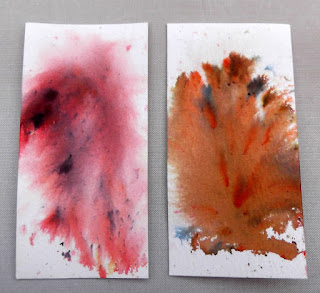
                                                    Rose Red                         Terracotta


                                                    Moss Green                       Yellow Ochre


                                                      Lime Green                    Olive Green


                                                     Burnt Sienna                    Sandstone

I do love these little magic crystals but think there are a few colours I could have managed without as you can see some are very similar particularly the reds and the Ultramarine is exactly like the Turquoise with speckles of Purple.  I love the ones that have different colours in them for spritzed backgrounds but I think to get the true colours you would have to dissolve and mix the crystals in a palette and paint on with a brush so when I have time I'll try that out as I do like to watercolour images occasionally.

Hope some of you might find this handy if you haven't succumbed to Brusho powders.

Sadly,I have a neighbour's funeral to attend this morning but I'll be back sometime later today with my tags and ATCs swaps for this month.

Hugs
Lesley  Xx

PS  I have no idea why Blogger moves the colour names across when I publish as they are centred in the draft!  Winds up my OCD, lol!